


The Era of Big and Tacky
 Admin
Admin Is the era of oversized fiberglass objects over? I think so.
I can appreciate a well-sculpted, well-painted, larger-than-life object used as a design element as much as the next guy… but where is the line drawn? It started in the mid 90’s. I’m not quite sure what started the trend, I only remember these things started to pop up everywhere. We've seen very few of these recently. Think about it. The American Idol show would have had an 80 foot microphone stuck to the building if it opened in 2002. I, for one, am happy to close this chapter in theme park history.
Top Ten List of Big and Tacky.
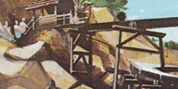
10) Carousel of Progress Sign
;)
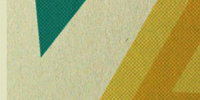
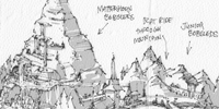
A big gear to go along with the 1994 redesigned Magic Kingdom Tomorrowland. In an attempt to make the land a little more industrial (for some reason), these huge gear shapes were implemented, including the pastel-colored shapes on the Carousel building itself.
9) California Adventure’s Big Orange
;)
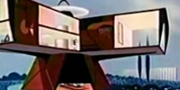
Something about bees flying around the inside of an orange and you are the bees, sitting in revolving swings? If you didn’t get a chance to hang out in this thing, I’m not sorry to announce it’s no longer there. The rendering on the right depicts "The Silly Symphonies Swings", to replace the orange.
8) Sorcerer’s Hat
;)
No, it’s not “Sorcerer Mickey’s hat”. The hat in the famous Fantasia short belonged to the actual sorcerer, not to Mickey Mouse. Mickey was the lowly apprentice who stole the hat. Ok. This is one of the biggest of history’s big and tacky pieces. Big enough to intentionally cover the view of the Chinese Theater (for some reason) and big enough to house a pin gift shop.
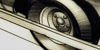
7) Aerosmith Guitar
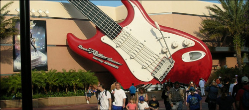
Well-crafted and hideous at the same time. At least it’s at Hollywood Studios, right? Probably part of the attempt to “reach the younger crowd.” Awesome.
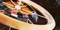
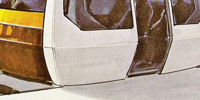
6) Astro Orbitor
;)
A terrible entrance to a once beautiful land and a destroyer of the aesthetics of a once beautiful Hub. But it's shiny.
5) Pink Cinderella Castle Cake
;)
I love this one. Even the most mindless lover of anything Disney can agree that this is a big pink nightmare. Ok, there are people who actually miss it. I must say there is one redeeming quality to this big, partially inflatable, fake candy-covered, cake castle- it was always intended to be temporary.
4) All-Star Resorts
;)
Wow. This is the Holy Land for lovers of big and tacky messes. And for high school groups needing on-property rooms for $79 a night.
3) POP Century Resort
;)
This is higher on my list than the All-Stars for one reason- large wording on the side of the hotel buildings such as “Far Out!”, “Cool Dude”, “Awesome”, "Radical", “Groovy”, and other classy terms written 40 feet long. It really is “awesome”.
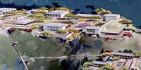
2) California Adventure’s Post Card Entrance
;)
This is number 2 on the list because it involves AN ENTIRE ENTRANCE TO A THEME PARK. And no one really notices what it is- it’s suppose to look like a thousand foot post card. It’s being removed soon as part of the DCA revamp, and thank you for that.
1) Mickey Hand on Spaceship Earth
;)
A big giant joke. “It will make kids like Epcot more. Uhh huh. Yeah. This makes the top of the list because it desecrated one of the greatest theme park icons of all time. I remember everyone saying “They can’t take it down 'cause it will affect the structural integrity of the big ball.” WHAT? The “big ball” had no problem standing on it’s own for 2 decades before Mickey’s hand came along. Oh and take a look… it only looks like it’s connected but it doesn’t even touch SSE. Thank you for taking this Disney World landfill.
Note: The reason DHS's Toy Story Mania (with all the big toys everywhere) did not make the list is for the fact that the story is about small objects surrounded by seemingly large objects..
Reader Comments (27)
"Before and after" picture of DL and DW always depress me. I almost always like what's in the "before" pictures better.
I find these oversized objects to be very unoriginal. Maybe at first they appeared to be original but a giant Coke bottle seems cliche and sub standard for a Disney theme park, not to mention all the ones listed above.
I'm thinking the Sorcerer's Hat is number three for me. Every time I see that thing I dry heave. It blocks the Chinese Theater only to sell crappy merchandise which is sold in every other gift shop in the park? Pointless and ugly. Sigh.
#5 makes my testicles shrink and go up inside my body every time I look at it.
Hahaha. My wife and I just laughed out loud reading Hoot's comment. I agree.
I agree with you on everything except the ' Carousel of Progress'. The "before" could have been any round building. It was boring and gray. At least the new version stands out.
I hope your right about this sort of thing going away, the freudian connection is jsut to big to ignore.
A lot of DCA is like this. The poor park was just built at the wrong time. That castle makes me sick. Who thought that was a good idea? The wand is aweful. The resorts listed are terrible but I don't mind much because they are not parks and are off the beaten path I guess.
I have to say, lately the things we've been seeing look pretty good. The new Fantasyland, the new DCA. Both look great compared to what we see in the list.
Early Disney was always pretty good at making things timeless. There are exceptions of course. Check out that cell phone.
I feel that you can make something oversized without it being tacky. None of these represent that but it could happen. I mean the Rose Parade does it well . Then again those floats are not permanent theme park fixtures.
My favorite never built oversized creation was that Mickey head shaped hotel that John Hench drew up. That would have been number 1 on my list.
Didn't Hench design those fire stations at Disney World? With big fake bricks and hoses and hydrents and stuff. Not horrible. Not my style either. Old Henchy was cool back in the pre-walt's death days. Then he wasn't so cool.
You cannot forget about the atrocities perched atop the Swan and Dolphin! Those Michael Graves monstrosities almost destroyed the views from within World Showcase.
Oh yes. That is pretty bad. I remember seeing the Swan and Dolphin when it was first open back 1990. My brother were kids and kept referring to it as the ugly hotel, even back then. It's somewhat grown on me sort of.
Am i seriously the only one who finds the sorcers hat cool? There's something about the fact that it's soooooo huge that brings out the little kid in me and I get excited.
Yeah the big hat was cool as an anniversary piece. It was a photo opp. And it was a "oh wow, kind of neat, right kids?" moment. But that moment has passed. A long time ago.
Nothing futuristic about giant cartoony plastic cogs. I would love to see that taken out of Tomorrowland. Hope to see more posts calling out this plastic cancer.
Hello? Are we all forgetting that this is a THEME park that was originally aimed at KIDS. Kids usually like big and tacky. Yes they want the adults to enjoy themselves too, but Disney is a company in the KIDS entertainment industry. Go ask some of the 6-10 year olds what they think of some of these. We have eaten at the Pop Century and I remember hearing several kids excited about the oversized icons and thinking they were cool. So before you get all offended that Disney had added something that you thing is hideous, try to look at it from a kids point of view, because that's who it's really for.
I have to respectfully disagree with Kristin. First of all, Disney parks were never originally aimed only at kids. Walt Disney specifically talked about making a place where kids and adults alike could enjoy themselves. Disney is in the FAMILY entertainment industry. Kids had no problem (myself included) enjoying the parks for the first 40 years before this "era of big and tacky" came about.
Second, it does not have to be tacky for kids to like it. There are about a billion things that I loved at Disney as a kid that were not tacky. I still love those things today. I feel that the list above shows things that have a short life-span of being liked.
There are a whole lot of things in the world that people like. This does not mean these things are good for the future and the integrity of the Disney company. People like fart noises (especially kids) but I do not think they should start adding them to the parks. I also (this is my opinion) dont' think they should make cheap-o resorts like the ones you see in the photos above. Yes, people like them but that should not be the determining factor on whether or not they are built. My point is that the Disney company once held itself to a much higher standard.
I respect people with the opinion that these things are good for the parks. Absolutely. But I hope they have more reasoning beyond "the kids like them".
While Sorcerer's Hat at the Hollywood Studios may not be the most fitting icon for a park, it was born out of neccesity. From what I understand, the ownership of the real Chinese Theatre passed onto new hands and they eventually changed the way in which Disney could use the likeness of the building. While they were allowed to continue to use the building, they could no longer use the likesness of the building to advertise the park. If you notice, no official advertising ties the likeness of the building as the icon of the park- Disney built the Hat as a way of creating a new park icon and hiding the old.
As a point of trivia, all photopass photographers are instructed to ensure the Hat obscures the view of the theatre in any photo. Also, the only signage to continue to use the theatre is located on the trashcans within the park- even then, its in silhouette.
While believe me I am in no way the biggest fan of the Mickey Hand on SSE it DOES serve a purpose. The Mickey hand is an Airplane Signal mandatory for all structures exceeding 200' which is why the newer Disney attractions, including the new Disney Mountain, Expedition Everest are a whopping 199' at most. So while i can agree it is not my favorite part of EPCOT better a structure that Imagineers can control then a giant signal rod sticking out of SSE.
A little blinking light on top is better than a big metal hand, especially considering what Epcot represents- nothing to do with Mickey and a magic wand.
This doesn't bother me as much as it does you. I have never minded the hat in DHS (though I do think it's pretty lame that they only use it to sell pins and I wouldn't be crying if they took it down.) The giant guitar actually kinda amuses me and I absolutely LOVE the Pop Century and All-Star resorts. Sure, a giant coke bottle and a buildings saying "far out" and "Awesome" isn't exactly classy, but it's FUN! Can't things just be FUN anymore?
Gotta agree with you on Tomorrowland though. Mainly the shiny gold color scheme Blech! And yes, that Castle cake is a real eye sore ><
I think the new DCA looks laughable. Look at that rendering pic of the Silly Symphony Swings, that girl must look stupid with that frumpy, ugly shirt. Very ugly artist rendering. It looks terrible. Orange Stinger looked cool.
The reason the big hat covers the Chinese Theater is because Disney was having some legal issues with the guy who made the actual version in Hollywood. They let them keep it as long as it was not the main icon of the park (like it once was). I just with they had picked something better!
Great article, I never thought about it that way, but I think you really hit the nail on the head. I guess it was cheaper and easier to do big plastic displays than actual think up fine detailed ideas.
For me, half the fun of going to disney parks is all the attention that goes into small details, I love discovering them on second glance. The problem with the big displays is not only that some are horribly tacky but also, that it is what it is. There is no backstory, no surprises, no fun little details to fall in love with. The magic of mainstreet, adventureland, or mann's chinese theatre is the lovely details. True, a giant hat or billboard can be fun, but you don't love it.
I used to frequent a disney board back around the 25th anniversary, all pretty rabid disney fans, including myself. ;) Not a single person had a good thing to say about that pink balloon castle, except that thank god it was short lived.
DCA, unfortunately, was all big plastic and billboards and to top it off, lacking in substance too. And the theatre from the outside was horrendous. It was suppose to be backstagy but it just looked unfinished. When I first moved to LA from San Fran, everyone told me not to waste my money on DCA. I couldn't believe something my beloved disney turned out could be bad, however even I had to admit it was sadly lacking any charm or sense of place, the exception being the shiny chrome California Zephyr (coffee shop) near the hub. I'm so excited about the new changes! I'm glad they are putting more thought into the ambiance. Thanks for the fun blog! :)
I couldn't agree with you more. When I did the Disney College Program it was my first visit to Disney World, having grew up in AZ and Disneyland being so close. I couldn't believe how tacky the aforementioned resorts were. Such an eyesore, and as you mentioned in your response to Kristin, it's true, kids don't need to catered to with giant eyesores. You can create something with class that's still fun. I loathe the sorcerer's hat in Hollywood Studio's. If they were having legal issues with representation of the Chinese theater, the should have found something better to block it's view or even re-purposed the building altogether. Good riddance big and tacky!
Not sure if anyone reads this post anymore, but the Carousel of Progress sign was recently replaced. If all of WDW Tomorrowland looked like the new, sleek, hexagon-shaped sign, then it would be fantastic.